2025-08-30的推文电泳条带强度值分析中的柱状图是用R的tidyplots包(1)做的。Tidyplots是ggplot2包(2)的一个延伸(extension)包。
在本推文中,将分别用ggplot2和tidyplots包来做这个柱状图,并比较两者的代码和效果。
测试数据下载链接:https://pan.baidu.com/s/1-hwYc2fkvuq_fPbtj5nrZQ?pwd=gkq7
1. 读取数据
library(readr) # 读取csv文件

file_name <- "raw_data/2025-08-30_bands.csv" # 数据文件名
tbl <- file_name |> read_csv(show_col_types = FALSE) # 读取数据

tbl |> dim() # 数据维度(5行9列)
[1] "file_name"                "Upper_band_sum"
[3] "Lower_band_sum"           "Upper_band_area"
[5] "Lower_band_area"          "averate_pixel_background"
[7] "Upper_band_sum_corrected" "Lower_band_sum_corrected"
[9] "Band_ratio"
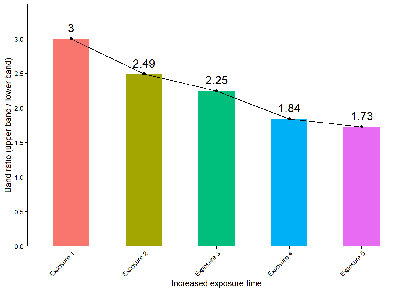
2. 用ggplot2包做柱状图
library(ggplot2) # 加载ggplot2包
ggplot2包的作者:Hadley Wickham
tbl |>
  ggplot(aes(x = file_name, y = Band_ratio)) +
  geom_bar(stat = "identity", aes(fill = file_name), width = 0.5) +
  geom_text(aes(label = round(Band_ratio, 2)), vjust = -0.8, size = 5) +
  geom_point() +
  geom_line(group = 1) +
  labs(x = "Increased exposure time", y = "Band ratio (upper band / lower band)") +
  theme_classic() +
  theme(axis.text.x = element_text(angle = 45, hjust = 1), legend.position = "none",
    axis.title = element_text(size = 10), axis.text = element_text(size = 8)) +
  scale_y_continuous(limits = c(0, max(tbl$Band_ratio) + 0.5), expand = c(0, 0),
    breaks = c(seq (0, max(tbl$Band_ratio) + 0.5, 0.5))) +
  scale_x_discrete(labels = c("20240104-3" = "Exposure 1",
                              "20240104-4" = "Exposure 2",
                              "20240104-5" = "Exposure 3",
                              "20240104-6" = "Exposure 4",
                              "20240104-7" = "Exposure 5"))
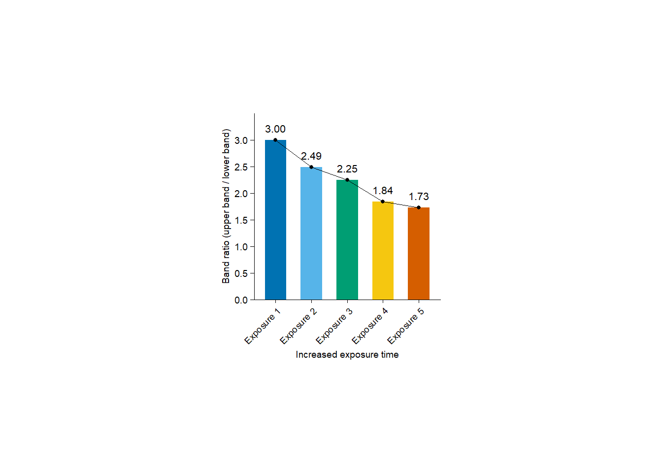
3. 用tidyplots包做柱状图
library(tidyplots) # 加载tidyplots包
Tidyplots包的作者:Jan Broder Engler
tbl |>
  tidyplot(x = file_name, y = Band_ratio, color = file_name) |>
  add_mean_bar() |>
  add_mean_value(color = "black", accuracy = 0.01, fontsize = 8) |>
  add_data_points(color = "black") |>
  add_mean_line(group = 1, color = "black") |>
  adjust_x_axis_title("Increased exposure time") |>
  adjust_y_axis_title("Band ratio (upper band / lower band)") |>
  adjust_x_axis(rotate_labels = 45) |>
  adjust_y_axis(limits = c(0, max(tbl$Band_ratio) + 0.5), breaks = c(seq(0, max(tbl$Band_ratio) + 0.5, 0.5))) |>
  rename_x_axis_labels(new_names = c("20240104-3" = "Exposure 1",
                                     "20240104-4" = "Exposure 2",
                                     "20240104-5" = "Exposure 3",
                                     "20240104-6" = "Exposure 4",
                                     "20240104-7" = "Exposure 5")) |>
  remove_legend()
更喜欢哪个风格?
给我买杯茶🍵