# load packages
library(tidyverse) # Load the tidyverse package (include ggplot2) for data manipulation and visualization
library(RColorBrewer) # For color palettes1 ggplot2“银河系”
ggplot2等高线图版本的“银河系”
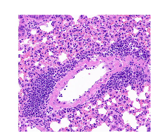
在2025-07-29日,我们展示过H&E起源版本的“银河系”(QuPath:“银河系”起源于H&E),笔者在这里尝试通过R的ggplot2(包括代码/R codes)来展示该“银河系”。
1. 加载R包
2. 读取表格数据并选择坐标列
# read the table containing the location of detected objects (i.e. nuclei)
txt_file <- "raw_data/2025-08-12_QuPath_InstanSeg.txt"
df <- txt_file |> read_delim(delim = "\t", col_names = TRUE, show_col_types = FALSE)
df |> names() # Display the column names [1] "Image" "Object ID" "Object type"
[4] "Name" "Classification" "Parent"
[7] "ROI" "Centroid X µm" "Centroid Y µm"
[10] "Area µm^2" "Length µm" "Circularity"
[13] "Solidity" "Max diameter µm" "Min diameter µm"
[16] "Hematoxylin: Mean" "Hematoxylin: Median" "Hematoxylin: Min"
[19] "Hematoxylin: Max" "Hematoxylin: Std.Dev." "Eosin: Mean"
[22] "Eosin: Median" "Eosin: Min" "Eosin: Max"
[25] "Eosin: Std.Dev." df <- df |> select(`Centroid X µm`, `Centroid Y µm`) # Select the two columns which correspond to the X and Y coordinates of detected nuclei
df |> head() # Display the first six rows of the data frame# A tibble: 6 × 2
`Centroid X µm` `Centroid Y µm`
<dbl> <dbl>
1 131. 88.4
2 118. 90.2
3 169. 90.9
4 179. 95.0
5 230. 96.5
6 119. 96.83. 增加一个“random_color”列,用于每个细胞核颜色的随机分配
palette <- brewer.pal(8, "Set2") # get a color palette

df <- df |>
  mutate(random_color = sample(palette, nrow(df), replace = TRUE)) # add a random color column

df |> head() # Display the first six rows of the updated data frame
# A tibble: 6 × 3
`Centroid X µm` `Centroid Y µm` random_color
<dbl> <dbl> <chr>
1 131. 88.4 #E78AC3
2 118. 90.2 #66C2A5
3 169. 90.9 #FFD92F
4 179. 95.0 #B3B3B3
5 230. 96.5 #FC8D62
6 119. 96.8 #FC8D62 4. 设定一个个性化的主题(theme)
# set a custome theme
custom_theme <- theme(
  panel.grid = element_blank(), # remove grid lines
  axis.text = element_blank(), # remove axis text
  axis.title = element_blank(), # remove axis titles
  axis.ticks = element_blank(), # remove axis ticks
  legend.position = "none", # remove legend
  panel.background = element_blank(), # remove panel background
  plot.background = element_blank(), # remove plot background
  plot.margin = margin(0, 0, 0, 0, "cm") # remove plot margins
)
5. 显示“银河系”对应的细胞核分布
ggplot(df, aes(x = `Centroid X µm`, y = `Centroid Y µm`)) +
  geom_point(aes(color = random_color)) + # scatter plot
  scale_x_continuous(limits = c(0, 896)) + # set x limits
  scale_y_continuous(limits = c(0, 768)) + # set y limits
  custom_theme # apply custom theme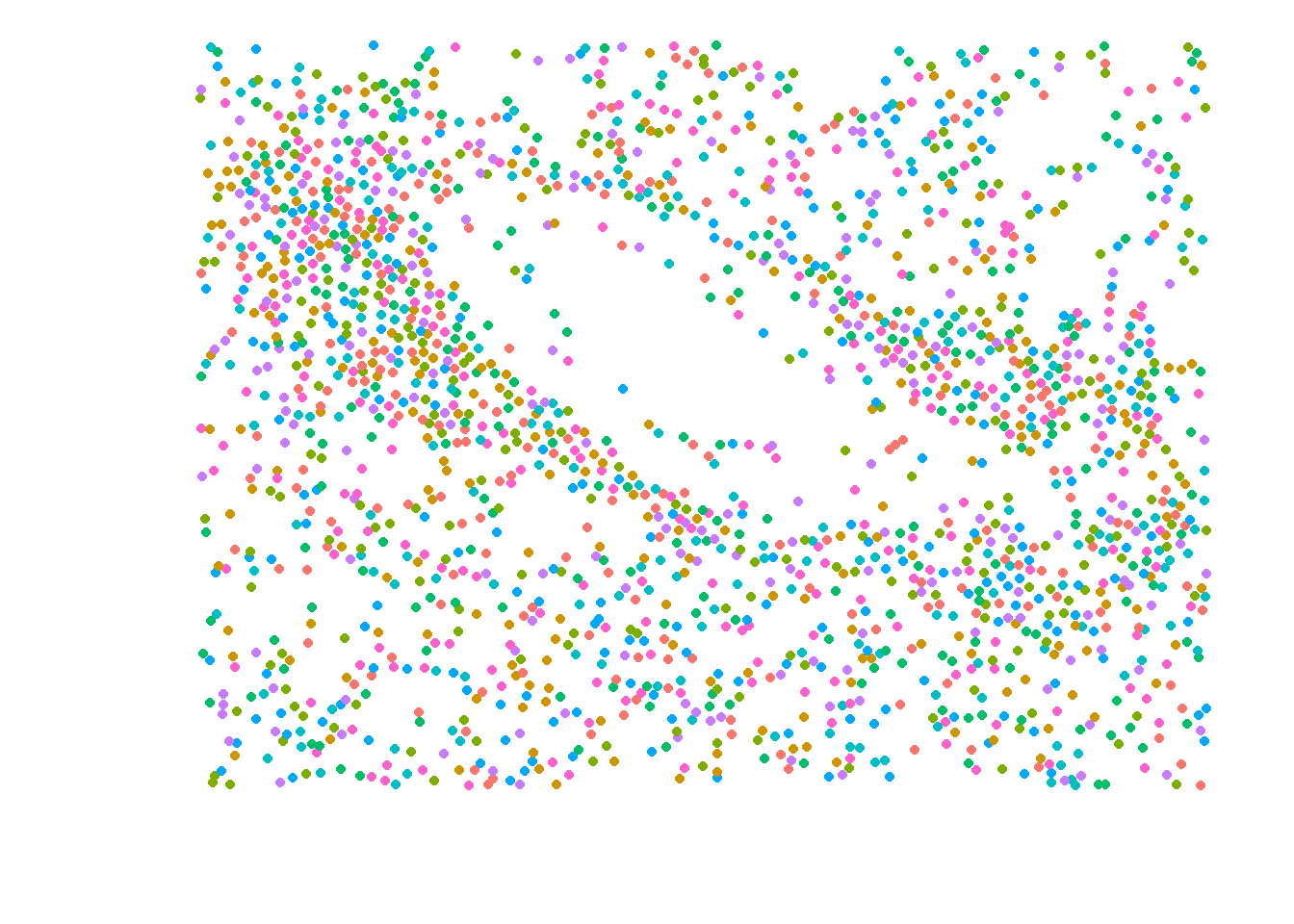
6. 显示“银河系”对应的细胞核分布和等高线图
ggplot(df, aes(x = `Centroid X µm`, y = `Centroid Y µm`)) +
  geom_point(aes(color = random_color)) + # scatter plot
  geom_density_2d_filled(alpha = 0.6) + # add filled contour lines with transparency
  scale_fill_brewer(palette = "YlGn") + # set fill color palette
  scale_x_continuous(limits = c(0, 896)) + # set x limits
  scale_y_continuous(limits = c(0, 768)) + # set y limits
  custom_theme # apply custom theme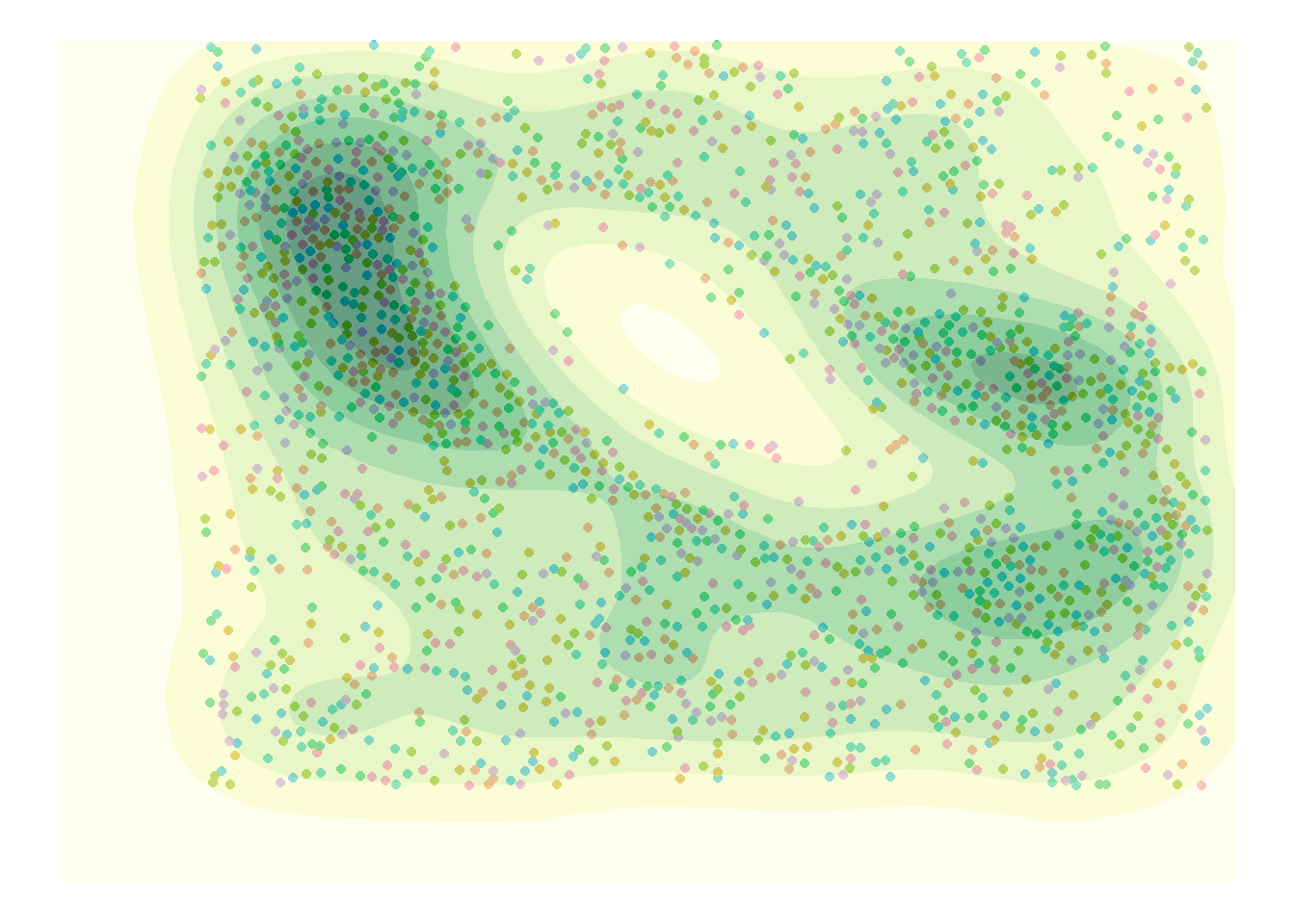
7. “银行系”的起源